
CLIENT
Starcare
SERVICES
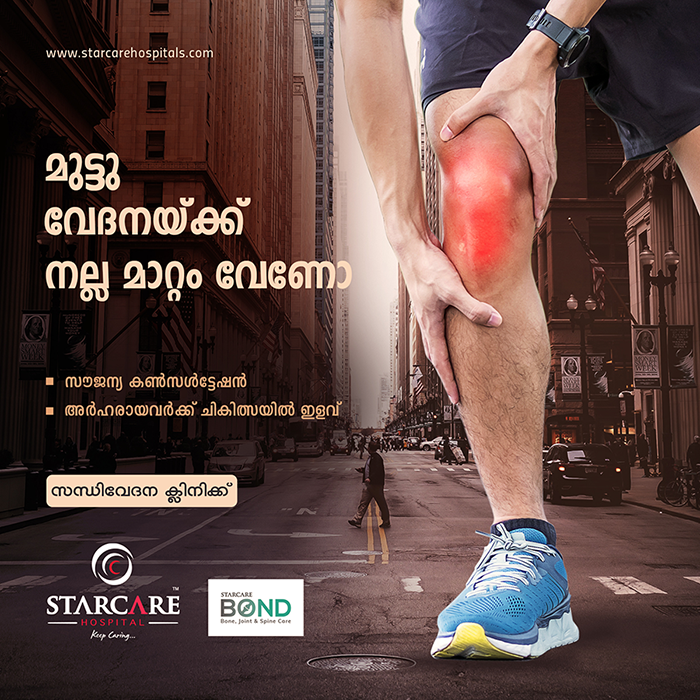
Creative Campaign
LOCATION
Calicut, India
CATEGORY
Design
The Project
An iconic style is an essential to ensure a brands’ corporate identity. Being an IT Product/Service Provider, Bettertech’s presence should make a positive difference so as to fix and fasten the project & processes in different industries. The first letter of Bettertech as its icon which resembles a forward arrow that suggests the company’s relentless pursuit of excellence.


Challenge
The client was looking for an identity that is relatable and easily remembered by the customers.
- Tone of trust and reliable.
- Must be relatable to target audience
- Convenient adaptation of identity in outdoor signage and print as well
Our Approach
The style we followed brings an icon in the brand name itself which is a modern and simple.
