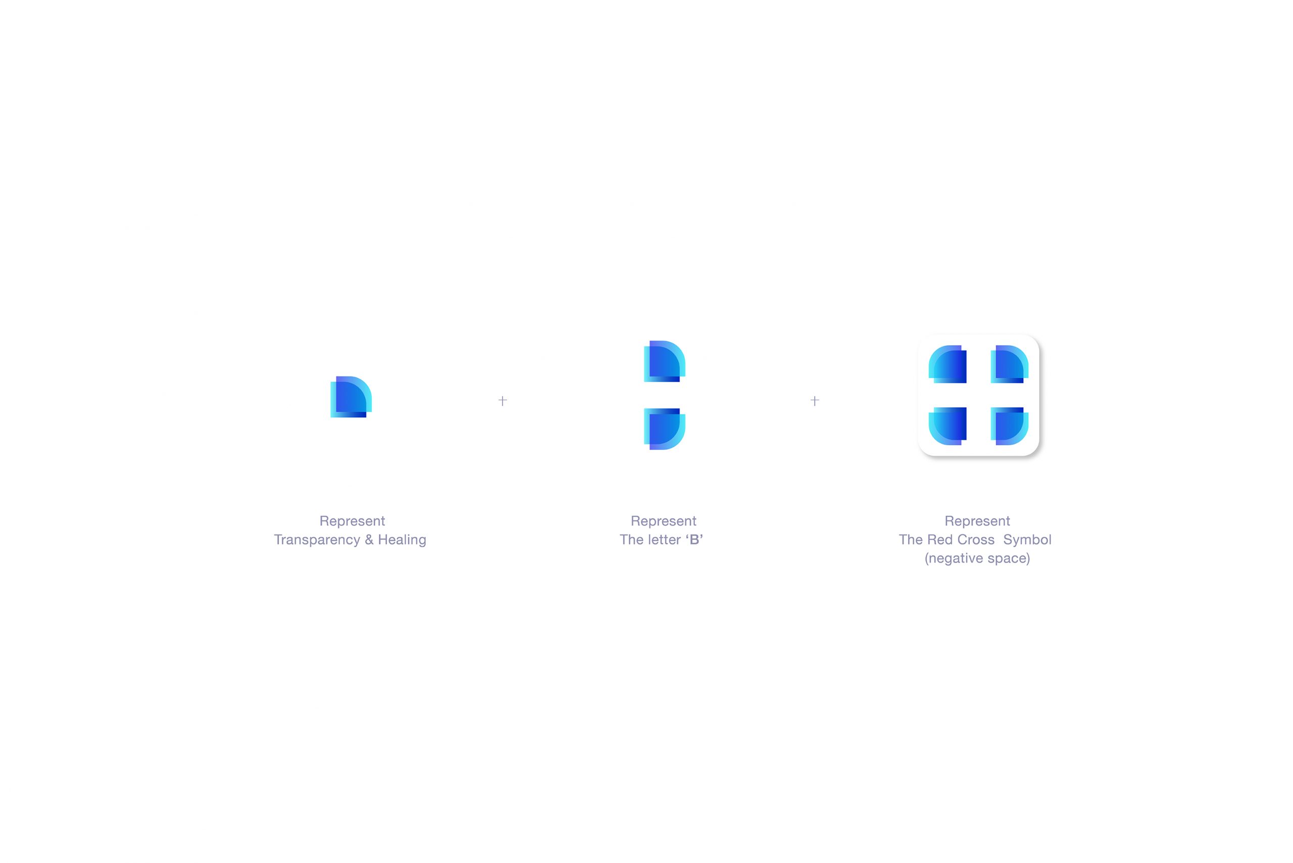
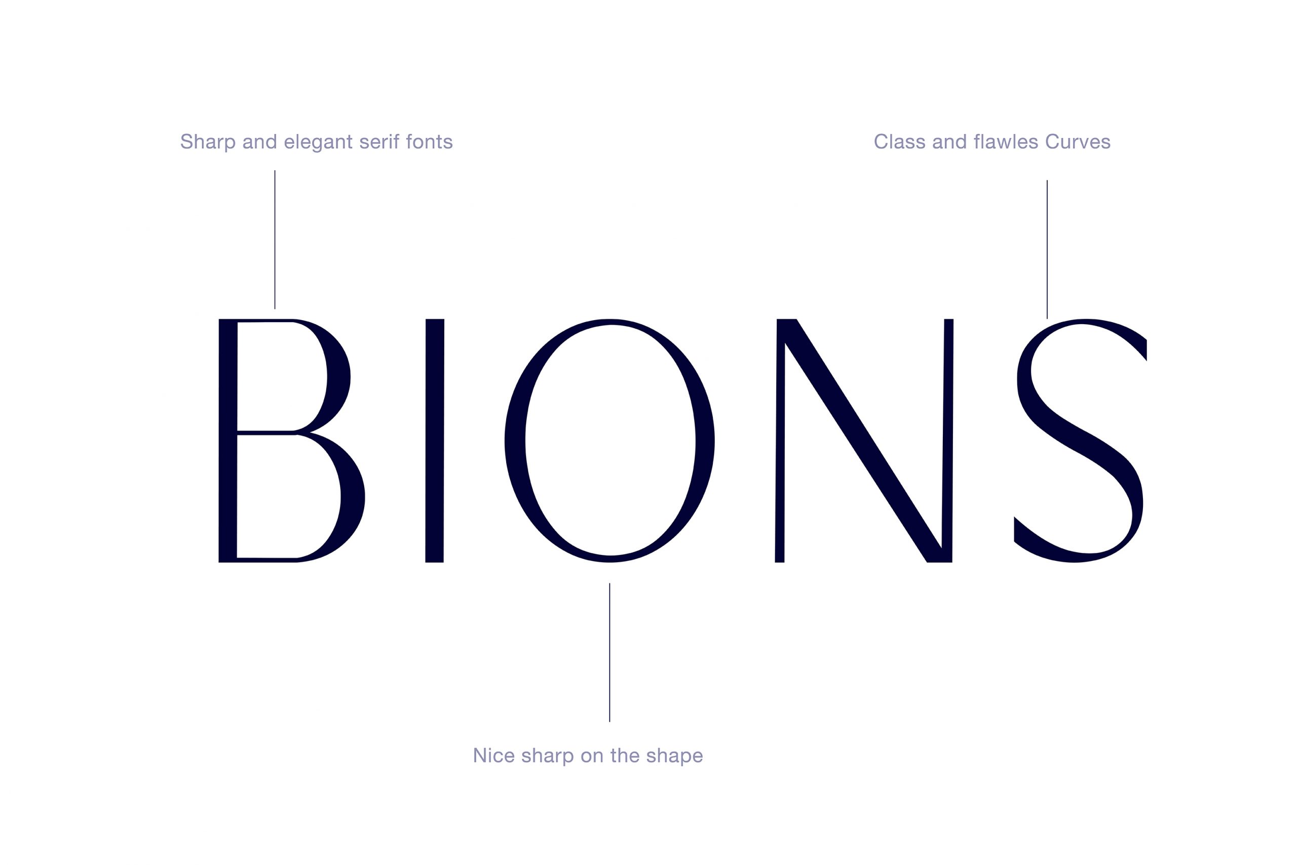
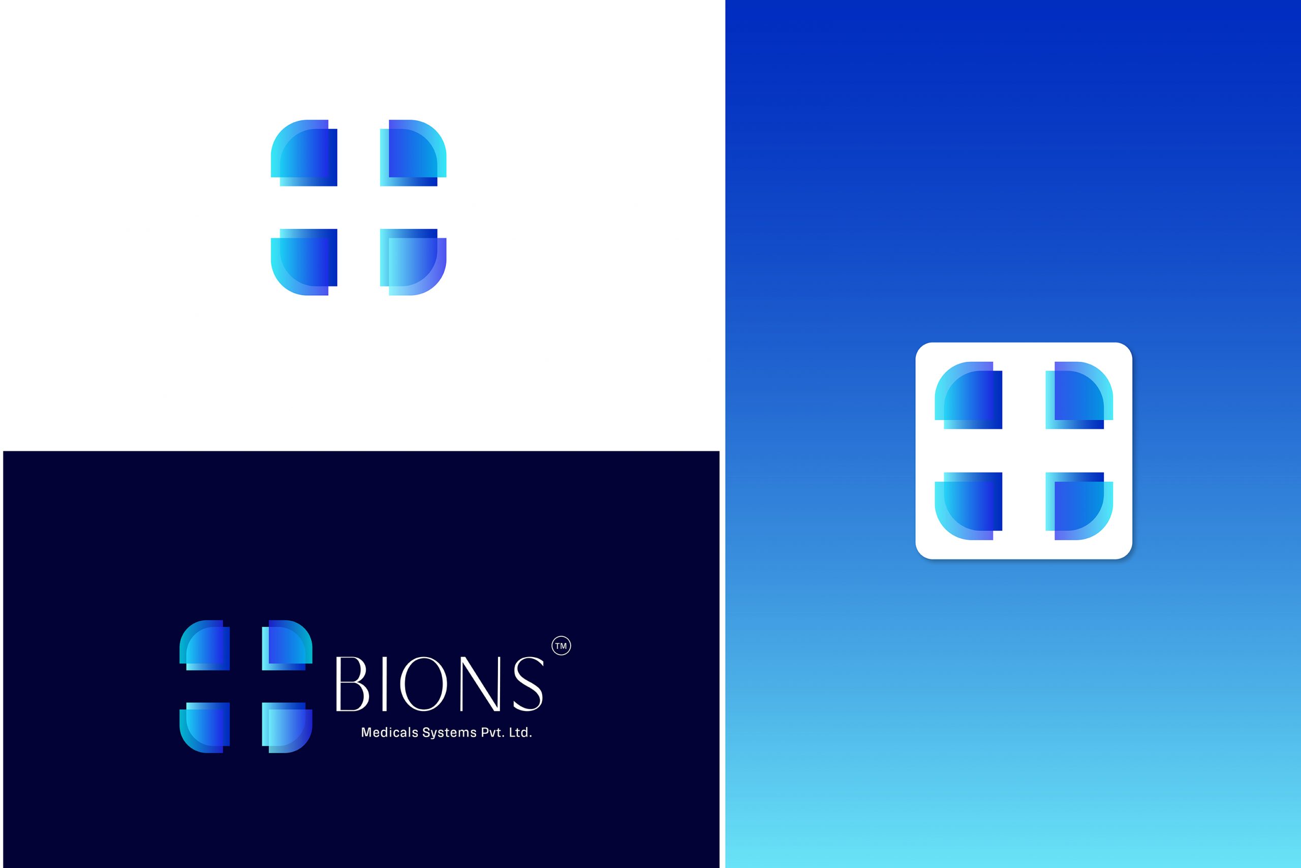
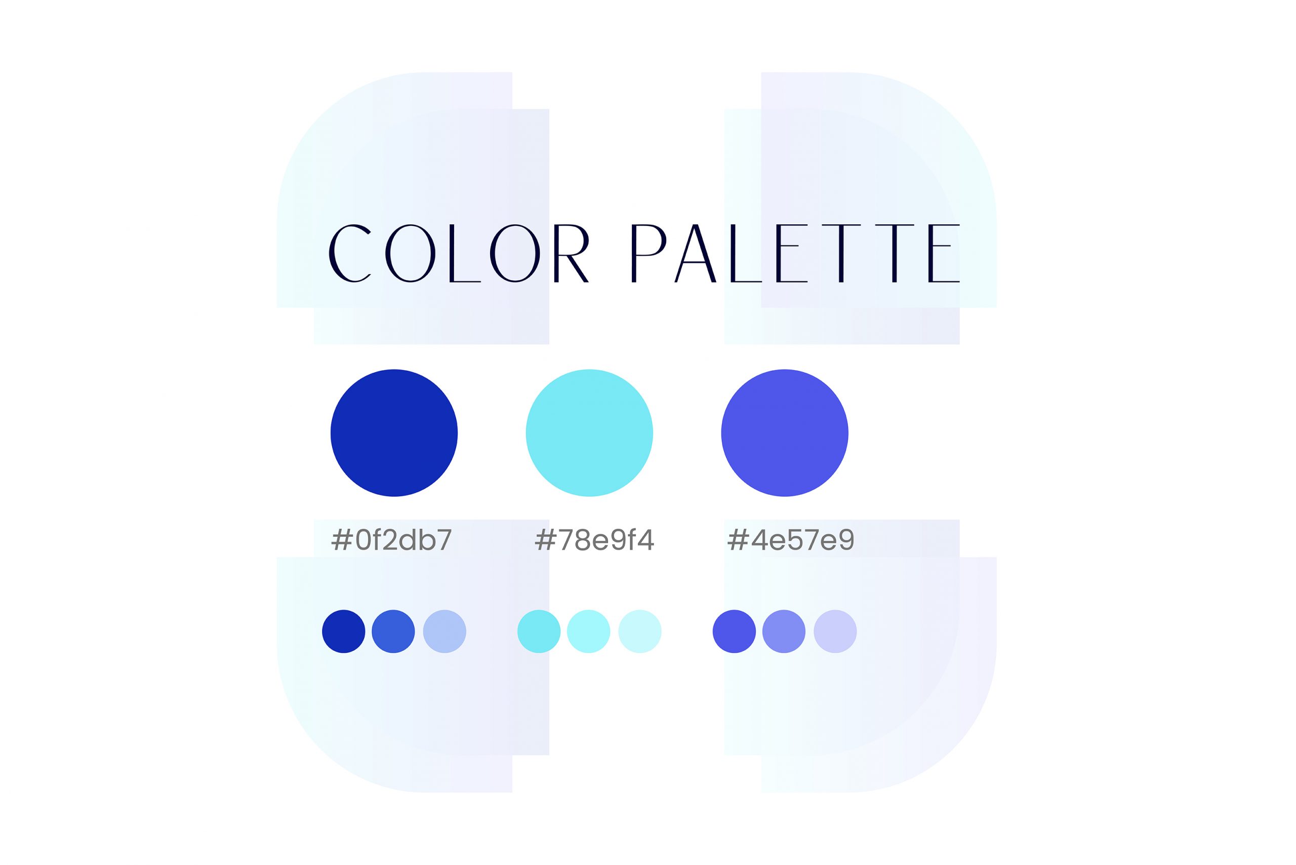
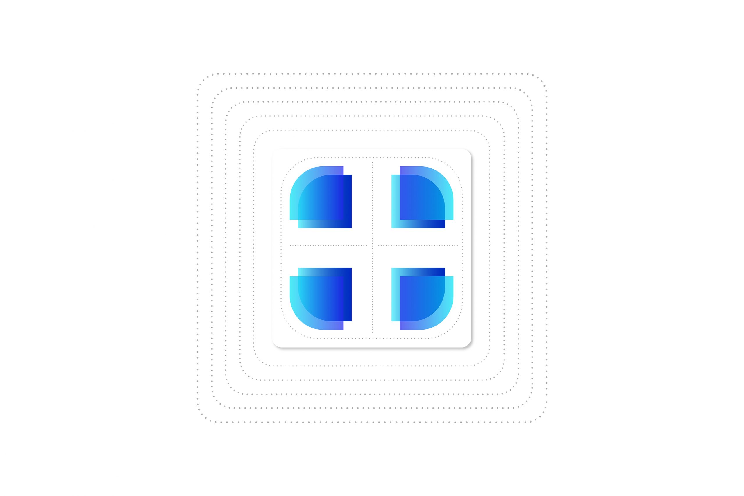
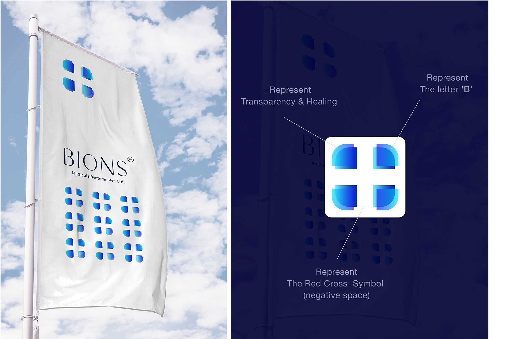
The logo is well crafted and constructed proportionately. The icon has an individual meaning behind it. The right part of the logo can be the symbol of the letter ‘B’ which is also the first letter of ‘BIONS’. The icon has edges that are sharp as a blade and soft as a smile at the same time, which implies the fixing and healing ability. We studied basic shapes and used them in the logo to incorporate the meaning of an individual with an idea, an idea that can heal the world. We used the shades ‘Ocean Blue’ to symbolize nature, sky and our mother earth that possess the feeling of warmth and care. The transparency in colours indicates how transparent we are and how sound our technology is.
Challenge
The client was looking for an identity that is relatable and easily remembered by the customers.
Tone of trust and reliable.
Must be relatable to target audience
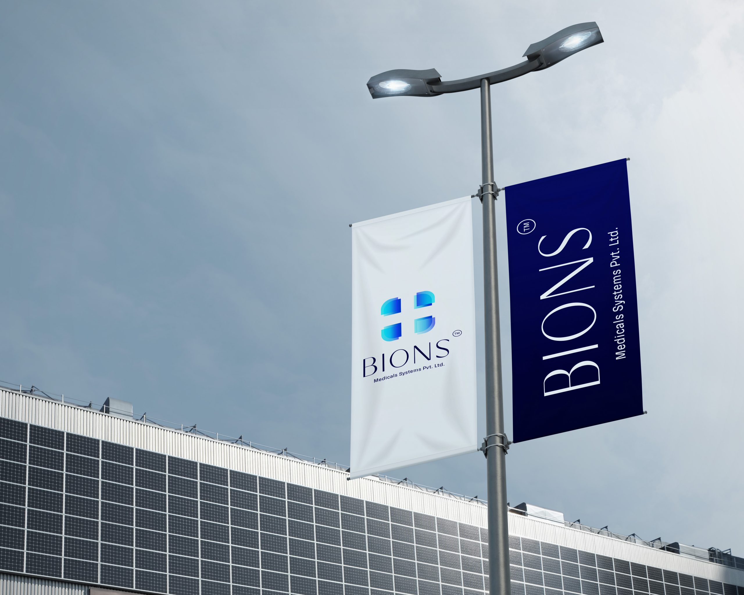
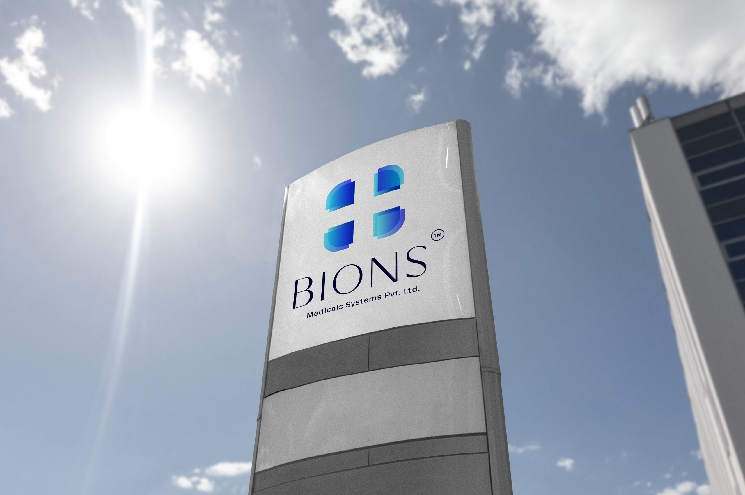
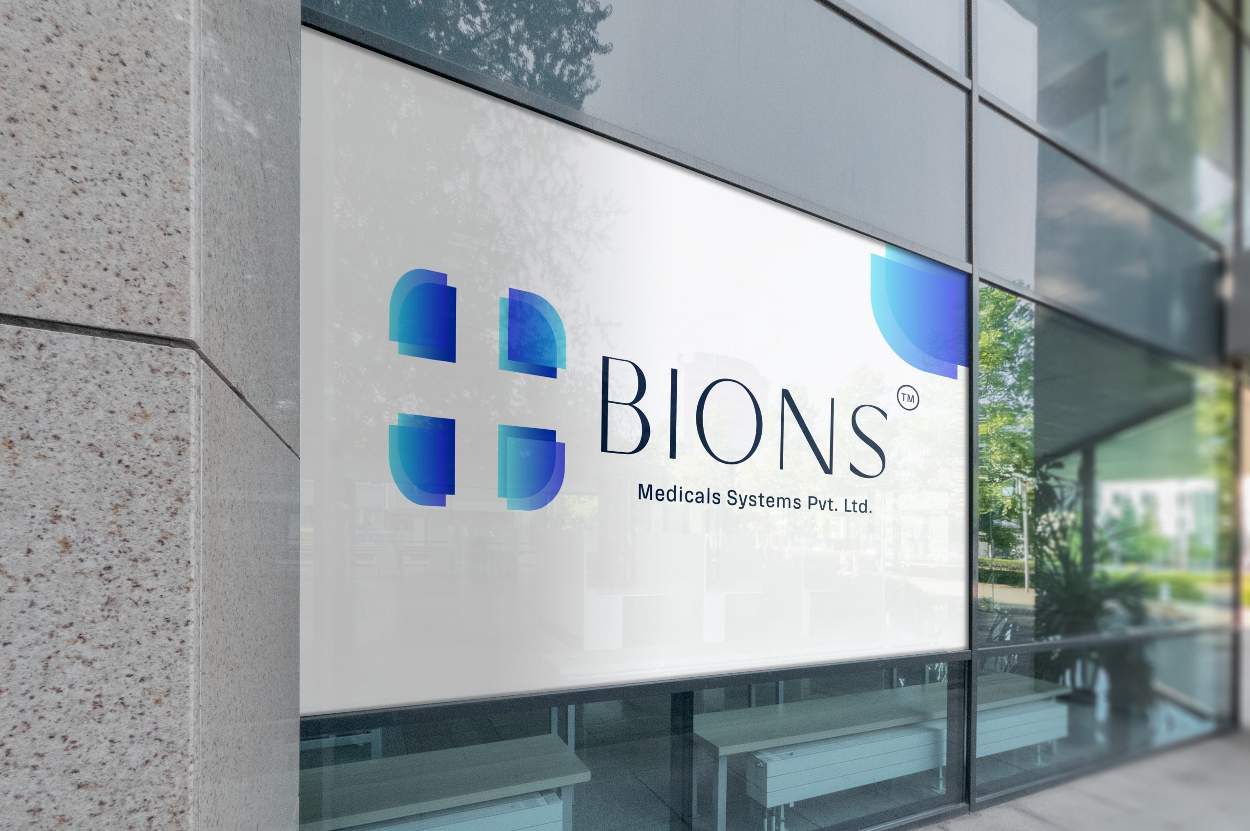
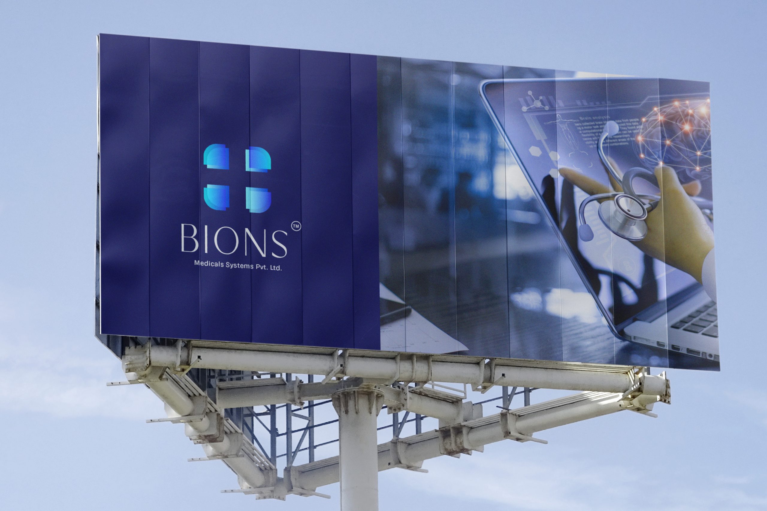
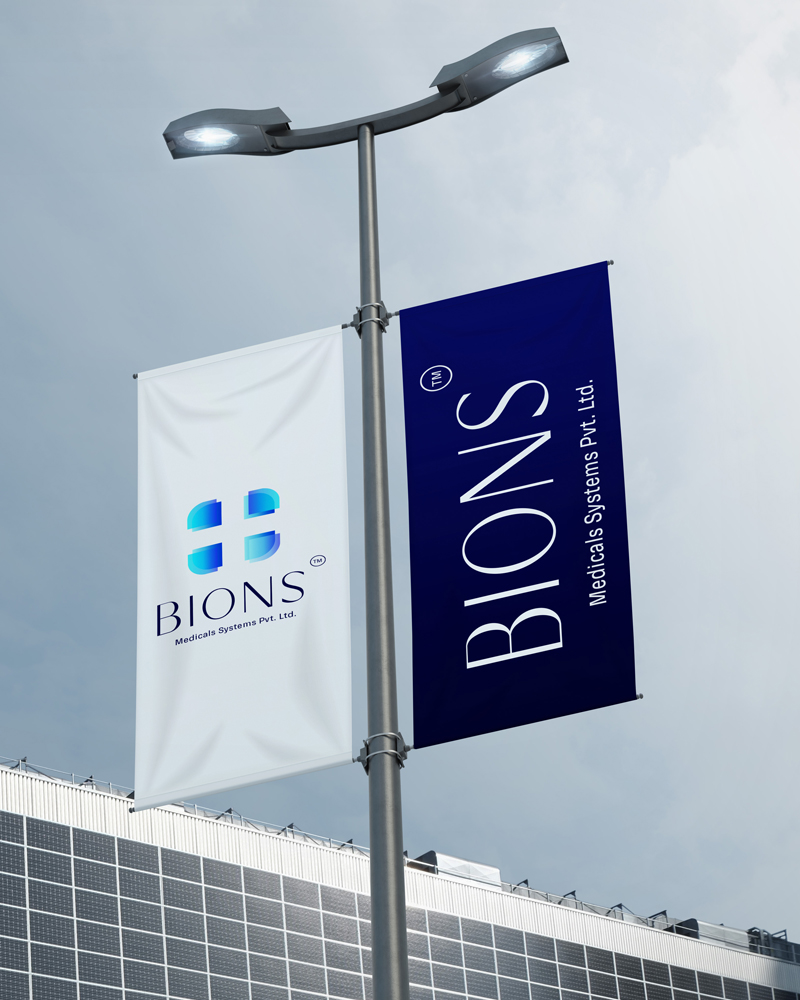
Convenient adaptation of identity in outdoor signage and print as well
Our Approach
The style we followed brings an icon in the brand name itself which is a modern and simple.